Credit: Edgar Cervantes / Android Authority
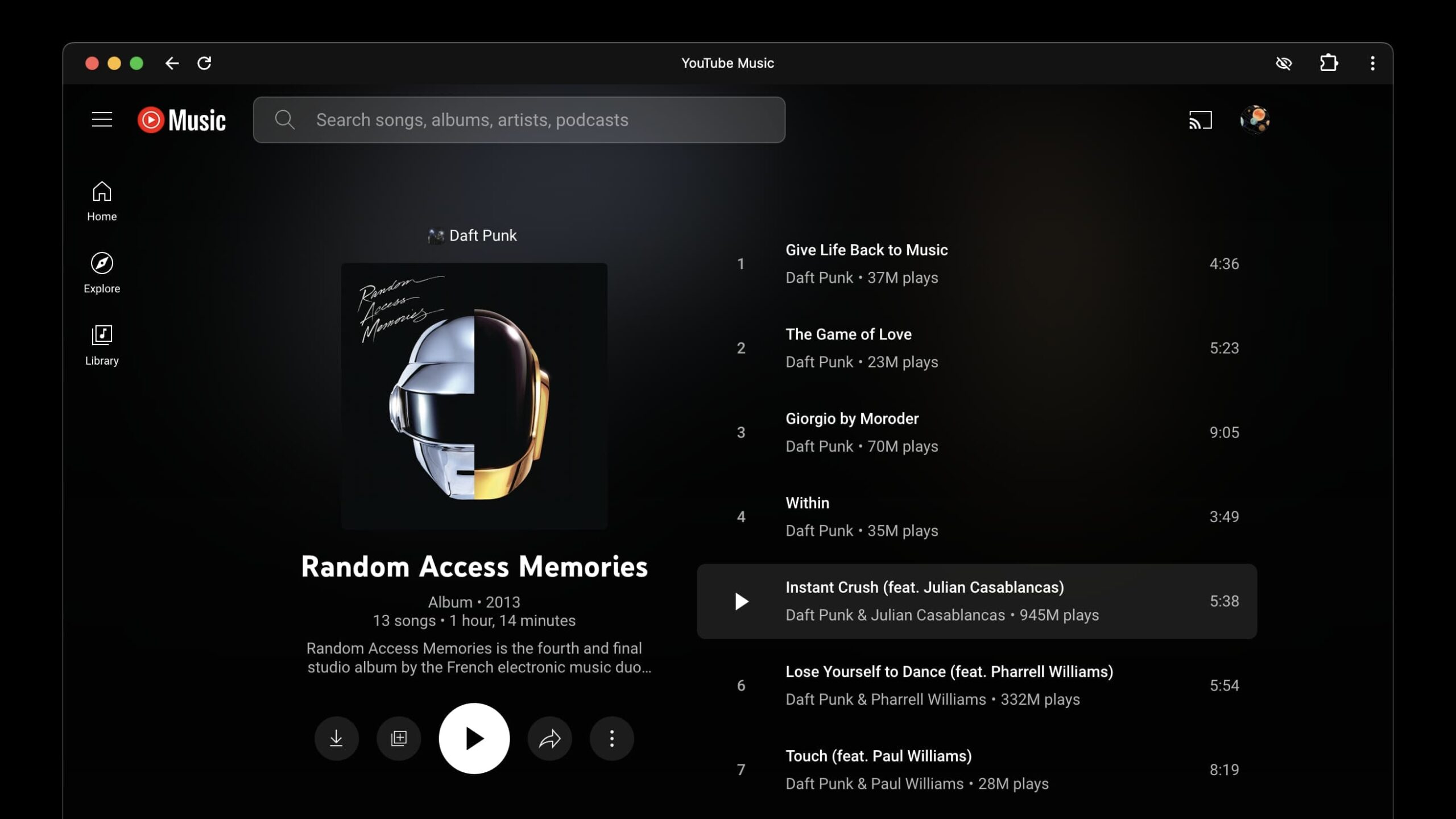
- YouTube Music has released a fresh layout for albums and playlists on its web app, better suited to large screens.
- The service first adopted the new UI on Android tablets, but it’s seemingly still unavailable on iPadOS.
- The update appears to be rolling out gradually, so it may take some time to reflect on your end.
YouTube Music is one of the most popular platforms for streaming your favorite tunes. Bundled with YouTube Premium, the service offers an extensive catalog, including unofficial covers and unreleased tracks you may not find elsewhere. However, its desktop UI was too basic for the longest time, mimicking a mobile design on large screens. Fortunately, the company has finally addressed this by optimizing YouTube Music’s web layout — particularly when viewing albums and playlists.
