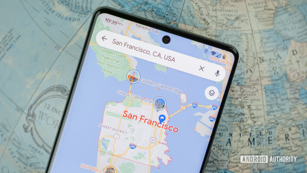
Credit: Edgar Cervantes / Android Authority
Google Maps has been the go-to mobile mapping solution for years now, and it’s absolutely loaded with features. However, a former Google Maps designer has criticized what she feels is a cluttered user interface and colder colors.
Elizabeth Laraki felt that the Google Maps UI contained too many elements that were overlaid on the map view. Do you share this opinion, though? We posed this question to you and here’s what you said.