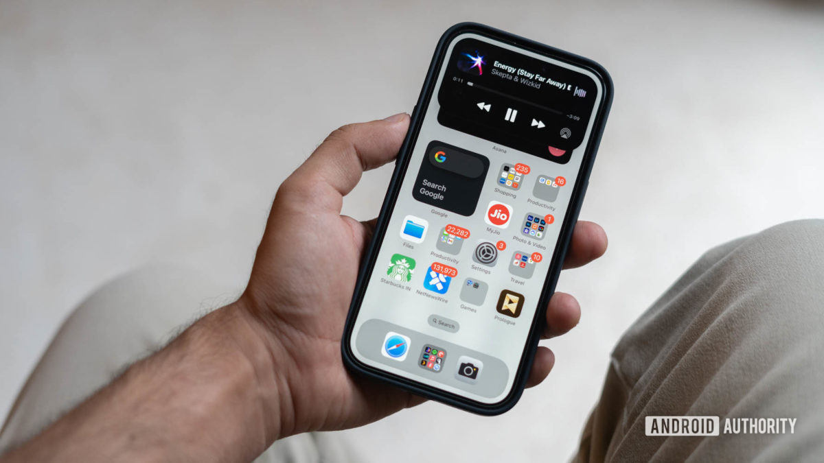
Apple’s design iteration of its principal money maker, the iPhone, is one of slow deliberation. In fact, Apple rarely, if ever, takes bold steps with the design. That said, it wouldn’t be unfair to call 2022 a special year. The company pulled a one-two surprise by introducing the Dynamic Island to the iPhone 14 Pro and gave the phone an all-new interface mechanism.
Sure, Dynamic Island’s quasi-multitasking approach is a clever ploy to hide the comically large camera and Face ID cutouts, but it’s also reminiscent of the quickly-retired MacBook Touch Bar in a way. It’s a quirky and innovative addition to the otherwise intentional-to-a-fault design of the iPhone, but it slowly faded in the background. One week into using the iPhone 14 Pro, I was loving the Dynamic Island’s heads-up approach toward critical alerts, quick access shortcuts, and navigation. One year later, I’ve all but forgotten about it.