It might surprise you, but Plex is the center of my media consumption. Much of what I watch has been dumped from my Blu-ray and DVD collection and, rarely, collected from the high seas. The platform offers me everything that streaming services don’t — ownership over my media, the ability to watch uncompressed video on my 75-inch television and home theater system, and the option to take it with me on the go.
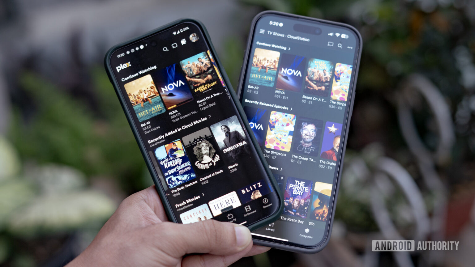
The refreshed Plex interface keeps most of the functionality and amps up the design.
But the one thing it’s been lacking is a great interface. Don’t get me wrong. The current Plex UI works and does everything you need from it. However, it looks dated, requires more taps than needed to accomplish oft-used tasks, and just doesn’t feel great. As it turns out, Plex thinks the same. There’s a new Plex interface out — on mobile first, but coming soon too other platforms — and I’ve been testing it over the last few days. Oh boy, there’s a lot to talk about here.