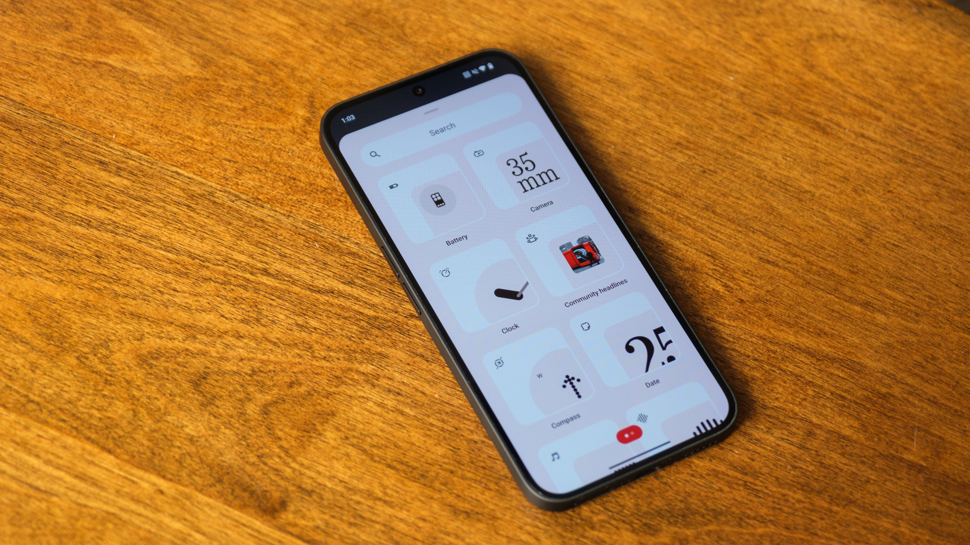
Nothing is well-known among Android fans. Its combination of transparent hardware design and dot-based software zigs every time the larger Android ecosystem would prefer to zag. Sometimes, the ambition works, like in the case of the fun, unique Glyph Interface. Other times, it simply confuses me, like the ringtones and notification chimes that sound like nails on a chalkboard. But, as time passes, it’s clear that Nothing is learning. It’s getting closer to what I think Carl Pei wanted when he spun off from OnePlus, and it all starts with Nothing’s approach to Android 15. I’ve spent a little time with the Nothing OS 3.0 beta and like what I’ve seen so far.
Dots, dots, and more dots
