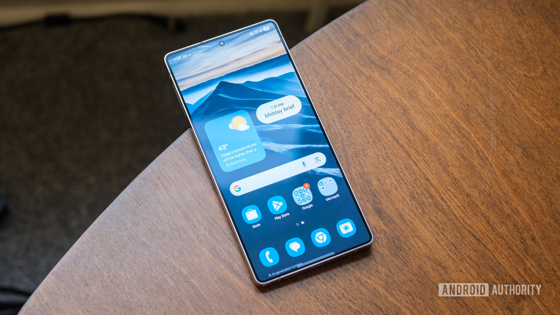
I like a lot of what Samsung has done with Android 15. It’s added several helpful wrinkles to One UI 7, like an alphabetized, vertical-scrolling app drawer, customizable widgets, and a Now Bar that draws out the best of Apple’s Dynamic Island without sitting quite as prominently at the top of the display. However, it’s done something else as part of the One UI 7 refresh — something I can’t stand. Samsung has split its notification shade from its quick settings dropdown, and it’s broken my brain a little bit.
Wait, what’s wrong with that?
