Credit: Joe Hindy / Android Authority
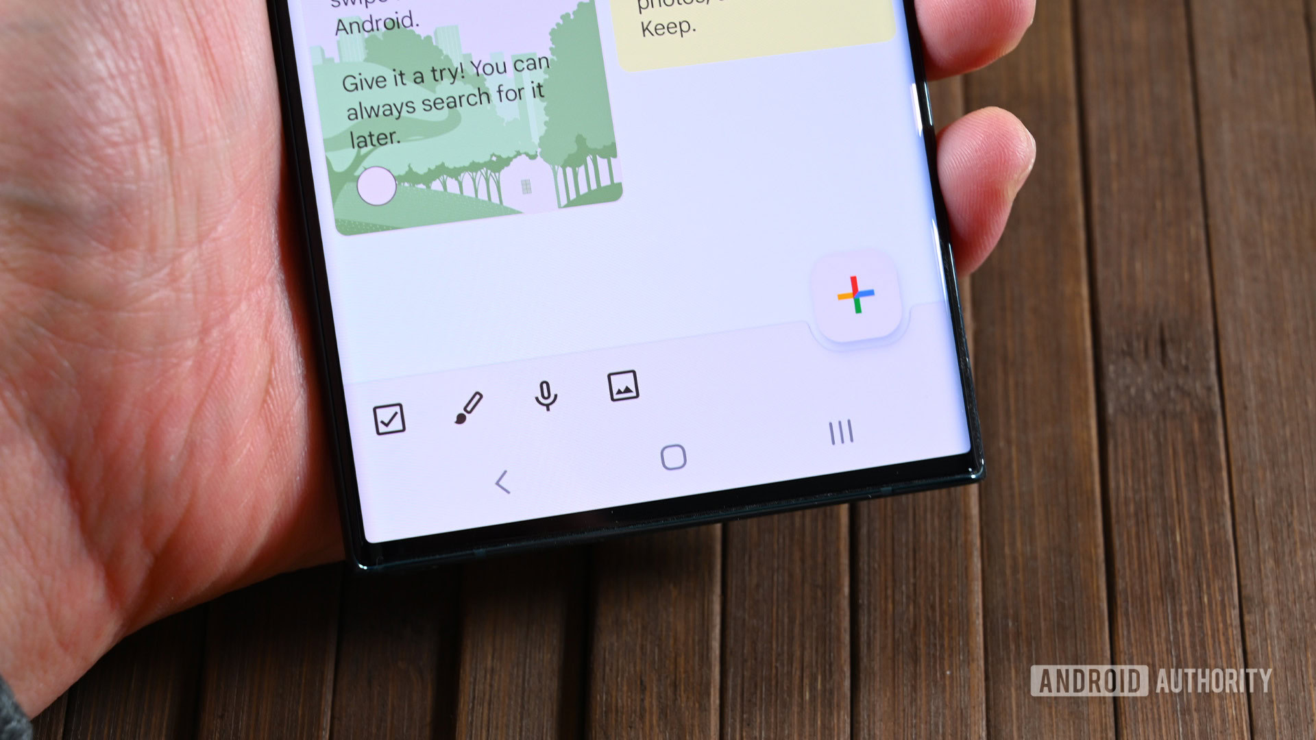
- A redesign is rolling out for Google Keep.
- The redesign removes the bottom bar and replaces it with a floating action button.
- Tapping on the new button will present most of the options that were previously available from the bar.
Get ready for the Google Keep app to look a little different the next time you open it up. The Android app is getting a redesign that streamlines the look and introduces a new floating action button (FAB).
In the past, if you looked at the bottom of the screen in the Keep app, you would see a bar. This bar had four options to choose from including list, drawing, audio, and photo. To the right of those options, there was also a button for adding a new note. That bottom bar is now gone in the latest version of the Android app, as reported by 9to5Google.