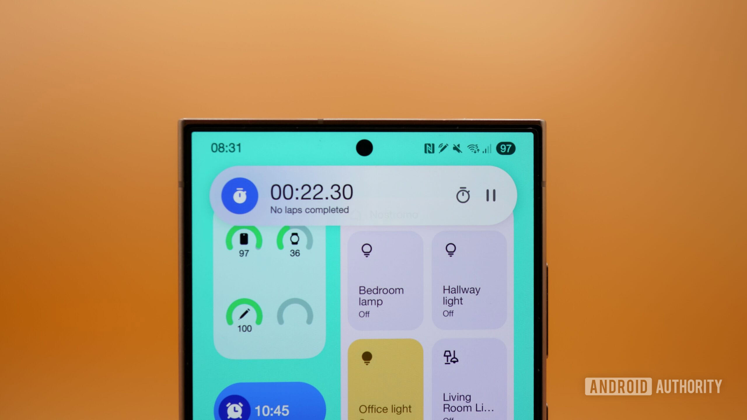
- With One UI 7 finally rolling out widely, many Galaxy S24 Ultra owners are voicing their displeasure with the status bar in the new update.
- There is more blank space in the top corners, which works well for phones with rounded corners but not for phones with sharper corners, like the Galaxy S24 Ultra and Galaxy S23 Ultra.
- This change also limits the number of icons the status bar can display, much to everyone’s displeasure.
After a bunch of misses, Samsung is finally rolling out One UI 7 widely. The new update is reaching users of older Galaxy flagships on the stable branch, making it the first time a lot of users are trying out Samsung’s Android 15-based update. While the overall impression of the update (outside of its rollout speed) is positive, many Galaxy S24 Ultra owners seem irked by the wasted space in One UI 7’s status bar.
Reddit user DiFF7Skyns highlighted the difference in the status bar across One UI 6.1 and One UI 7. In their composite image, we can see that icons start and end closer to the edges on One UI 6.1, whereas One UI 7 has unnecessary blank space at the left and right edges.