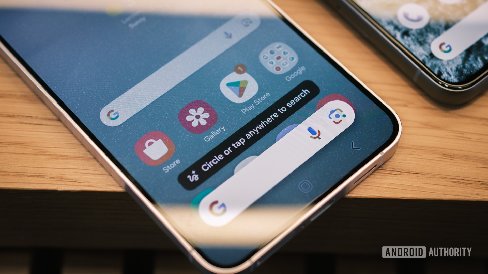
- A new version of the Google app has revealed a new UI for Circle to Search.
- The new UI moves features like the translate and Google Lens buttons into an app drawer button.
- This comes several weeks after Google removed the Lens button from Circle to Search.
Google’s Circle to Search is a handy way to quickly search your screen and perform more actions. Google recently made the polarizing decision to remove the Lens button from the Circle to Search bar, but it looks like a more significant change could be on the way.
A recent version of the Google app (15.45.43.ve.arm64 beta) has revealed a redesigned Circle to Search UI. This is a chunkier interface compared to the current UI, with the UI elements now encased in a rounded box. However, the biggest change is that we’ve now got an app drawer in place of the translate button. Check out the video below and screenshots further down the page via Telegram user @John9498 for a better idea of what to expect.