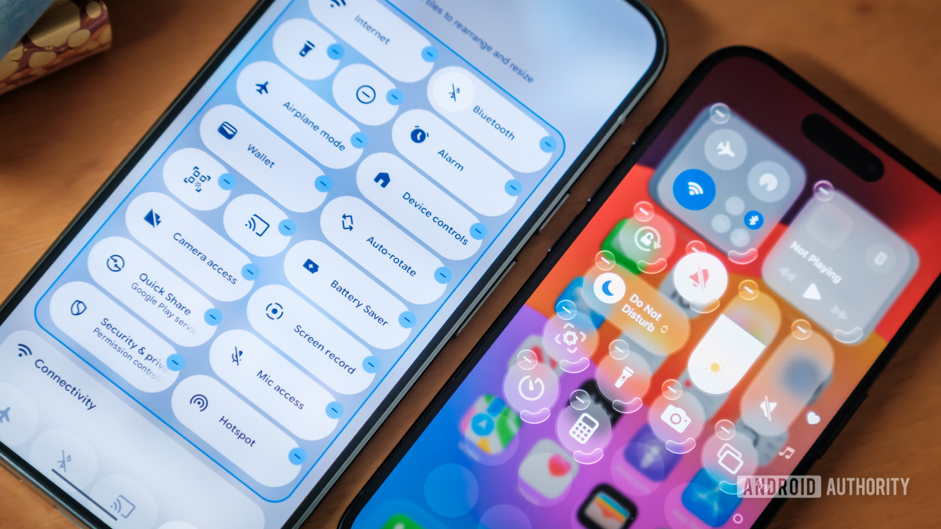
Credit: Robert Triggs / Android Authority
I’ll admit, I’m hard to please when it comes to UI, but that might be because I’m the sort of person who secretly wishes were peering at green text and living in a world of cassette futurism. I had to invent a new word to describe my displeasure with Google’s Material 3 Expressive revamp, but it’s a bastion of sane design compared to the eyesore that was Apple’s Liquid Glass debut. Honestly, why is modern UX too often hard to get right?
But if there’s one thing worse than either of them, it’s brands copying each other’s bad choices. The revelation that Android 17 is preparing to adopt parts of Apple’s transparent aesthetic had me reaching for the sick bucket.