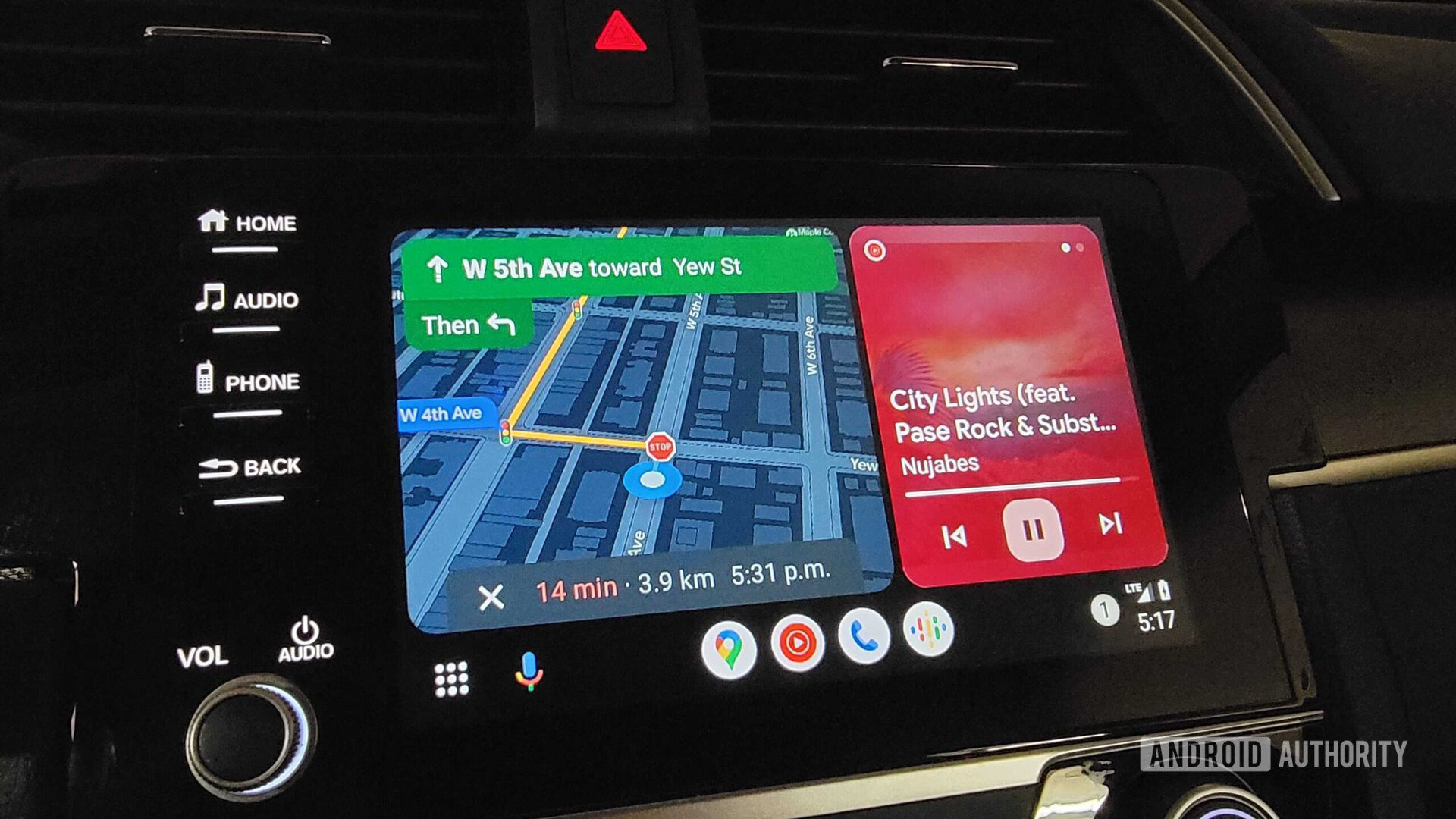
- Google’s latest Android Auto update introduces a new visual interface for Google Assistant during voice interactions.
- The new UI features a colorful, animated wave that bears a striking resemblance to Apple’s Siri interface on CarPlay.
Google has recently given the Google Assistant experience in Android Auto a facelift. The new look, which pops up during voice chats with the Assistant, is drawing comparisons to Apple’s Siri on CarPlay. We’ll let you decide if that’s indeed the case.
First spotted by 9to5Google, Google Assistant on Android Auto seems to be getting a new circular hovering UI with a dynamic, colorful wave that animates in response to voice activity, occupying the lower portion of the screen. Notably, this new interface doesn’t replace the Google Assistant bar at the bottom of the screen, which is still your go-to for starting commands. Instead, this new design takes center stage when the Assistant is waiting for your response — like when it needs you to pick which coffee shop you actually want directions to.