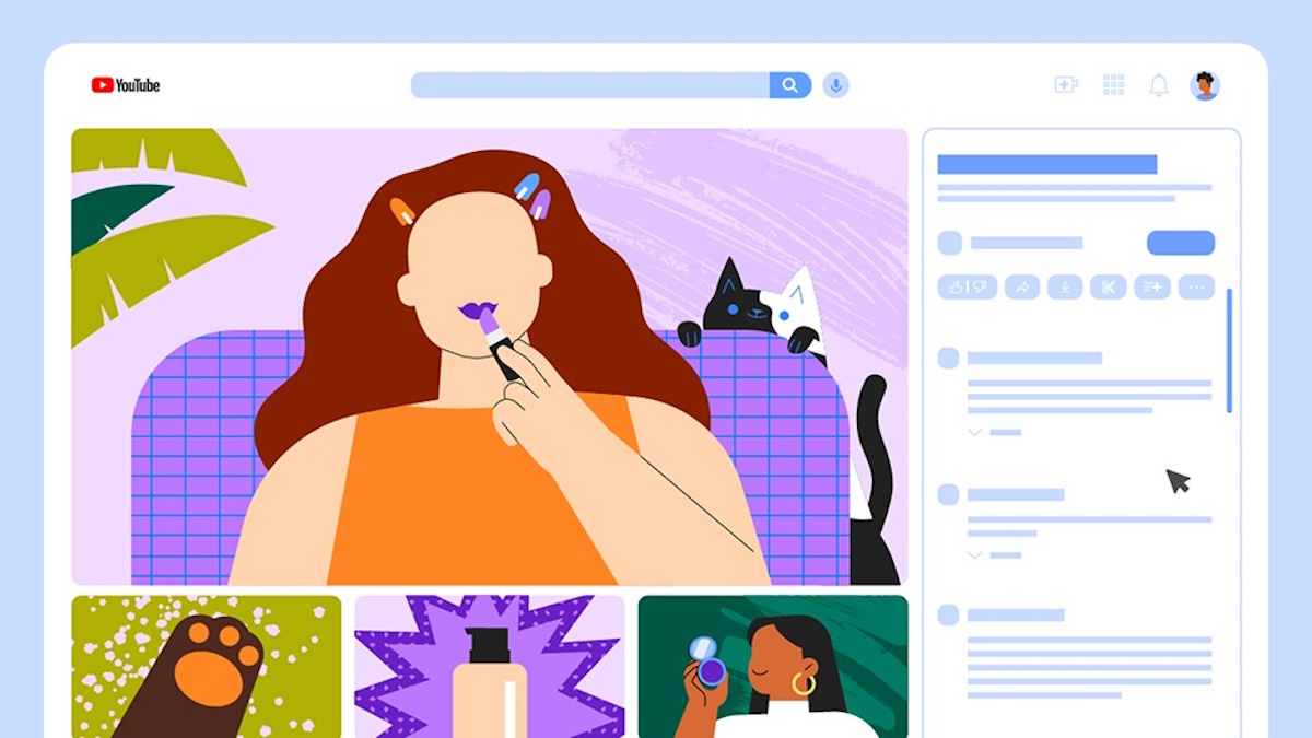
- YouTube Premium users can now test YouTube’s redesigned UI and provide feedback.
- The experimental redesign moves the title, description, and comments to the right side of the video player and recommended videos to the bottom of the video player.
YouTube is testing a redesign with desktop users, and opinion on it is divided, to put it mildly. The platform is experimenting with putting the title, description, and comments to the right of the video player rather than under it and placing video recommendations at the bottom. If you want to try this redesign out, you can pay to become a YouTube Premium subscriber and get a chance to try the experimental redesign before it goes live for all (if at all it does).
As spotted by 9to5Google, YouTube Premium’s experimental features page now lists the new “Redesigned Watch Page” as one of the features that subscribers can opt into. This redesign on desktop seemingly makes it easier to find related content but also “enhances your ability to engage with comments.”